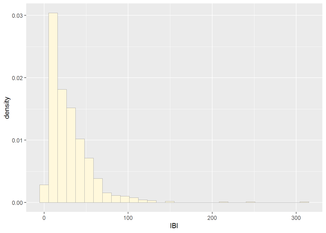
Running the code on my data. The variable chosen is the inter-breath
intervals (dive times, in seconds) of bottlenose dolphins. These
measurements were taken in the Mexican Caribbean between 2021 and 2022
(Paredes-Torres et al., 2025).
library(ggplot2)
library(MASS)
## Warning: package 'MASS' was built under R version 4.4.2
##
## Adjuntando el paquete: 'MASS'
## The following object is masked from 'package:dplyr':
##
##     select
## The following object is masked from 'package:patchwork':
##
##     area
# my dataset
z <- read.table("ibi.csv",header=TRUE,sep=",")
str(z)
## 'data.frame':    826 obs. of  4 variables:
##  $ IBI      : num  4 78.3 20 60.8 57 ...
##  $ Cump     : chr  "NN" "NN" "NN" "NN" ...
##  $ NB       : int  7 7 7 7 7 7 7 7 7 7 ...
##  $ distancia: chr  "menos de 30m" "menos de 30m" "menos de 30m" "menos de 30m" ...
summary(z)
##       IBI              Cump                 NB         distancia
##  Min.   :  2.244   Length:826         Min.   :0.000   Length:826
##  1st Qu.: 12.993   Class :character   1st Qu.:1.000   Class :character
##  Median : 23.312   Mode  :character   Median :3.000   Mode  :character
##  Mean   : 30.892                      Mean   :2.933
##  3rd Qu.: 40.853                      3rd Qu.:4.000
##  Max.   :311.924                      Max.   :9.000
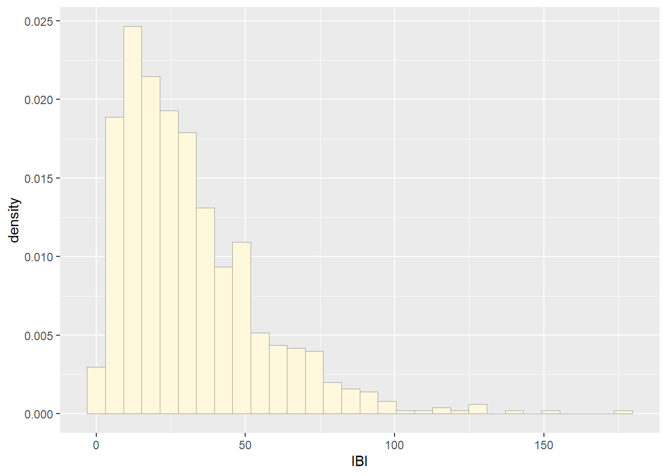
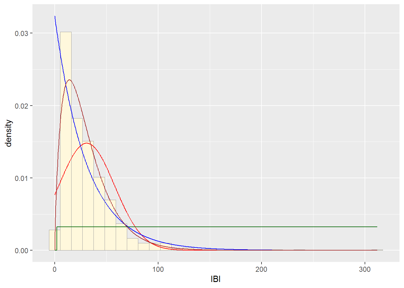
## Plot histogram of data
p1 <- ggplot(data=z, aes(x=IBI, y=..density..)) +
  geom_histogram(color="grey60",fill="cornsilk",linewidth=0.2)
print(p1)
## Warning: The dot-dot notation (`..density..`) was
## deprecated in ggplot2 3.4.0.
## ℹ Please use `after_stat(density)` instead.
## This warning is displayed once every 8 hours.
## Call `lifecycle::last_lifecycle_warnings()` to
## see where this warning was generated.
## `stat_bin()` using `bins = 30`. Pick better
## value with `binwidth`.
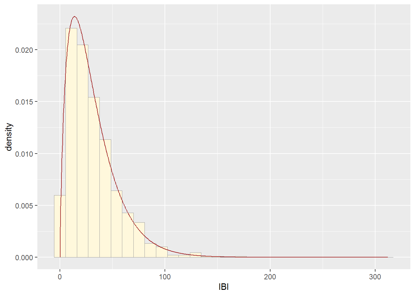
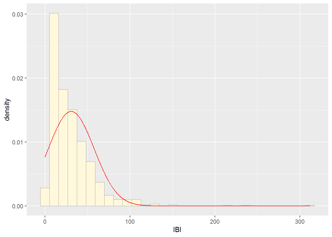
##Get maximum likelihood parameters for normal
normPars <- fitdistr(z$IBI,"normal")
print(normPars)
##       mean          sd
##   30.8915000   26.9542898
##  ( 0.9378597) ( 0.6631669)
str(normPars)
## List of 5
##  $ estimate: Named num [1:2] 30.9 27
##   ..- attr(*, "names")= chr [1:2] "mean" "sd"
##  $ sd      : Named num [1:2] 0.938 0.663
##   ..- attr(*, "names")= chr [1:2] "mean" "sd"
##  $ vcov    : num [1:2, 1:2] 0.88 0 0 0.44
##   ..- attr(*, "dimnames")=List of 2
##   .. ..$ : chr [1:2] "mean" "sd"
##   .. ..$ : chr [1:2] "mean" "sd"
##  $ n       : int 826
##  $ loglik  : num -3893
##  - attr(*, "class")= chr "fitdistr"
normPars$estimate["mean"] # note structure of getting a named attribute
##    mean
## 30.8915
##Plot normal probability density
meanML <- normPars$estimate["mean"]
sdML <- normPars$estimate["sd"]

xval <- seq(0,max(z$IBI),len=length(z$IBI))

stat <- stat_function(aes(x = xval, y = ..y..), fun = dnorm, colour="red", n = length(z$IBI), args = list(mean = meanML, sd = sdML))
p1 + stat
## `stat_bin()` using `bins = 30`. Pick better
## value with `binwidth`.
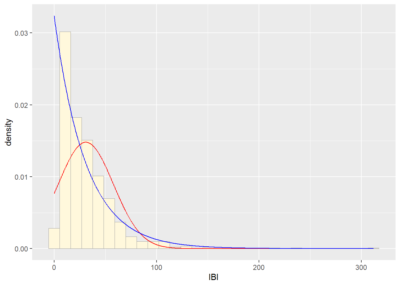
##Plot exponential probability density
expoPars <- fitdistr(z$IBI,"exponential")
rateML <- expoPars$estimate["rate"]

stat2 <- stat_function(aes(x = xval, y = ..y..), fun = dexp, colour="blue", n = length(z$IBI), args = list(rate=rateML))
p1 + stat + stat2
## `stat_bin()` using `bins = 30`. Pick better
## value with `binwidth`.
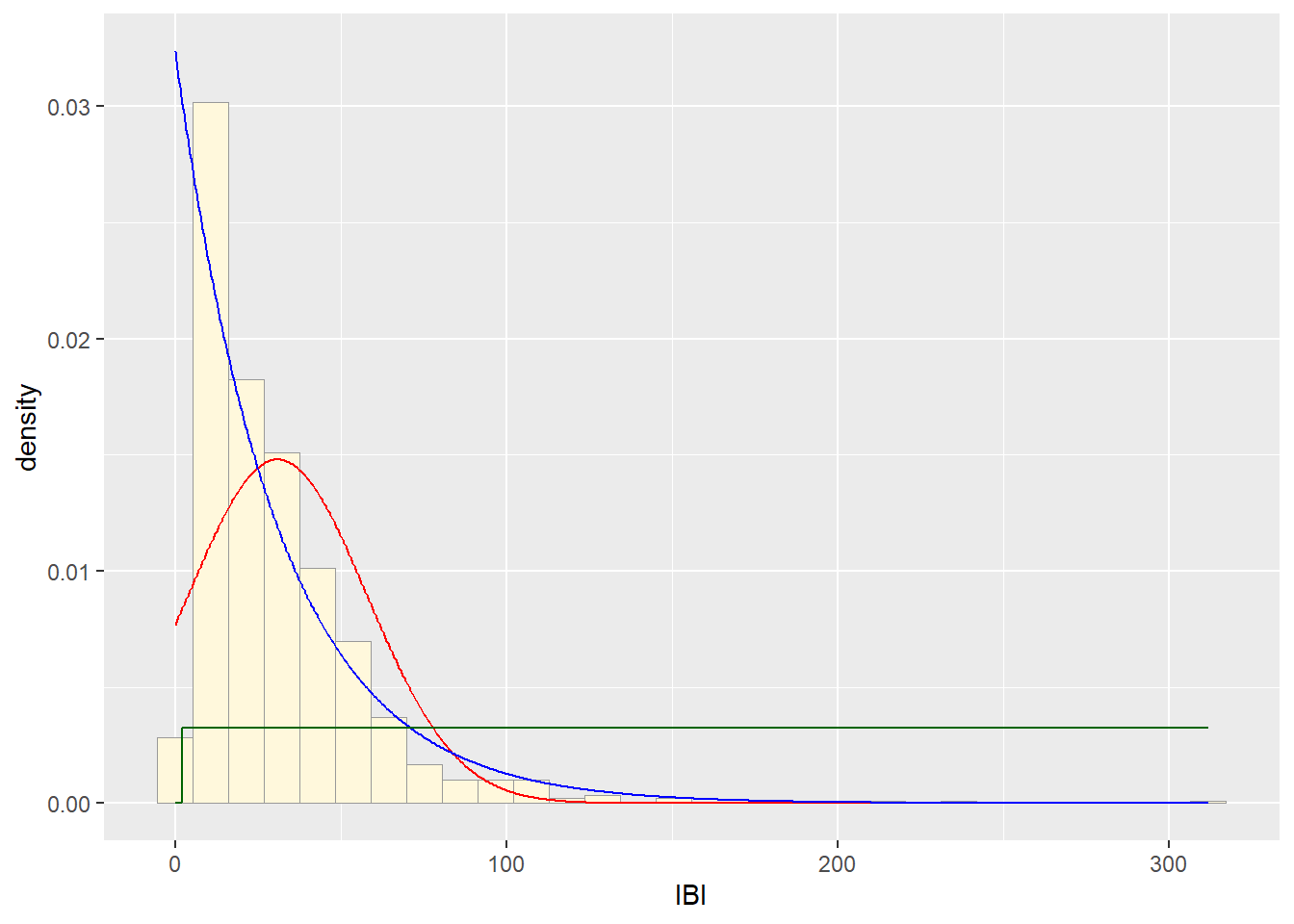
##Plot uniform probability density
stat3 <- stat_function(aes(x = xval, y = ..y..), fun = dunif, colour="darkgreen", n = length(z$IBI), args = list(min=min(z$IBI), max=max(z$IBI)))
p1 + stat + stat2 + stat3
## `stat_bin()` using `bins = 30`. Pick better
## value with `binwidth`.
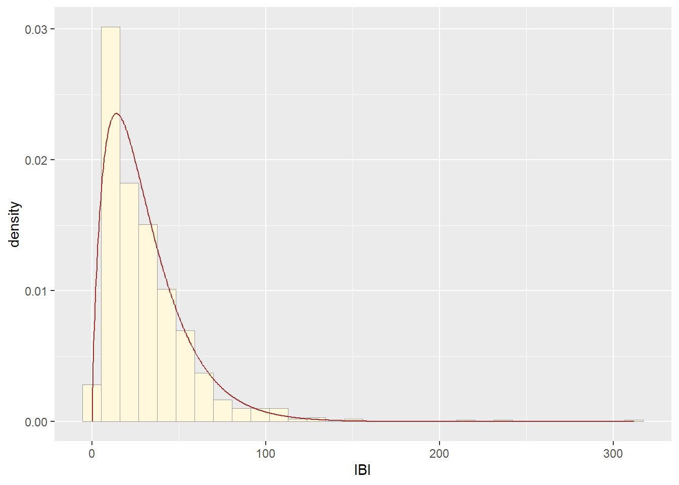
###Plot gamma probability density
gammaPars <- fitdistr(z$IBI,"gamma")
shapeML <- gammaPars$estimate["shape"]
rateML <- gammaPars$estimate["rate"]

stat4 <- stat_function(aes(x = xval, y = ..y..), fun = dgamma, colour="brown", n = length(z$IBI), args = list(shape=shapeML, rate=rateML))
p1 + stat + stat2 + stat3 + stat4
## `stat_bin()` using `bins = 30`. Pick better
## value with `binwidth`.
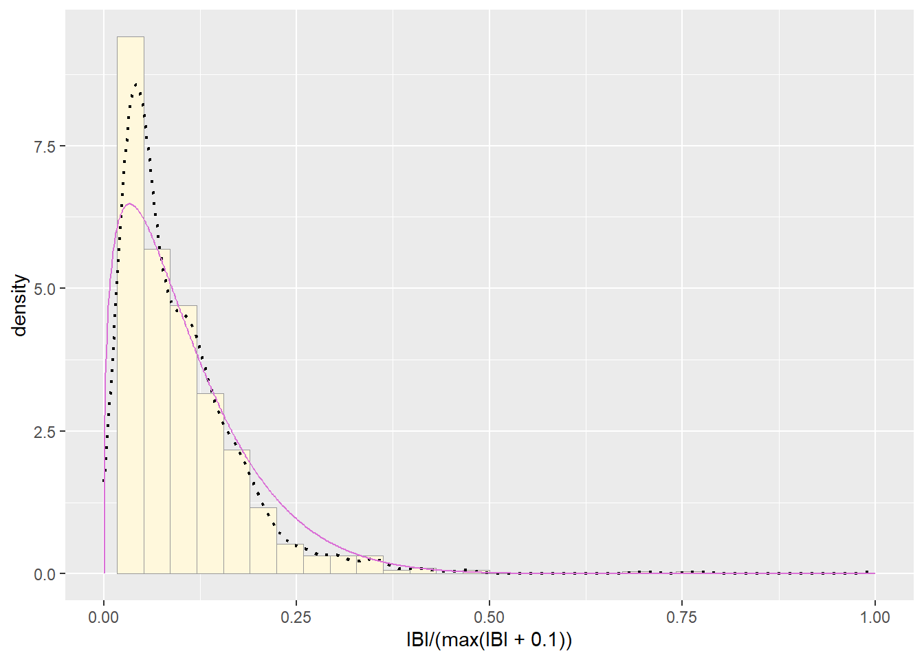
##Plot beta probability density
pSpecial <- ggplot(data=z, aes(x=IBI/(max(IBI + 0.1)), y=..density..)) +
  geom_histogram(color="grey60",fill="cornsilk",size=0.2) +
  xlim(c(0,1)) +
  geom_density(size=0.75,linetype="dotted")
## Warning: Using `size` aesthetic for lines was
## deprecated in ggplot2 3.4.0.
## ℹ Please use `linewidth` instead.
## This warning is displayed once every 8 hours.
## Call `lifecycle::last_lifecycle_warnings()` to
## see where this warning was generated.
betaPars <- fitdistr(x=z$IBI/max(z$IBI + 0.1),start=list(shape1=1,shape2=2),"beta")
## Warning in densfun(x, parm[1], parm[2], ...): Se han producido NaNs
## Warning in densfun(x, parm[1], parm[2], ...): Se han producido NaNs
## Warning in densfun(x, parm[1], parm[2], ...): Se han producido NaNs
## Warning in densfun(x, parm[1], parm[2], ...): Se han producido NaNs
## Warning in densfun(x, parm[1], parm[2], ...): Se han producido NaNs
shape1ML <- betaPars$estimate["shape1"]
shape2ML <- betaPars$estimate["shape2"]

statSpecial <- stat_function(aes(x = xval, y = ..y..), fun = dbeta, colour="orchid", n = length(z$IBI), args = list(shape1=shape1ML,shape2=shape2ML))
pSpecial + statSpecial
## `stat_bin()` using `bins = 30`. Pick better
## value with `binwidth`.
## Warning: Removed 2 rows containing missing values or
## values outside the scale range (`geom_bar()`).